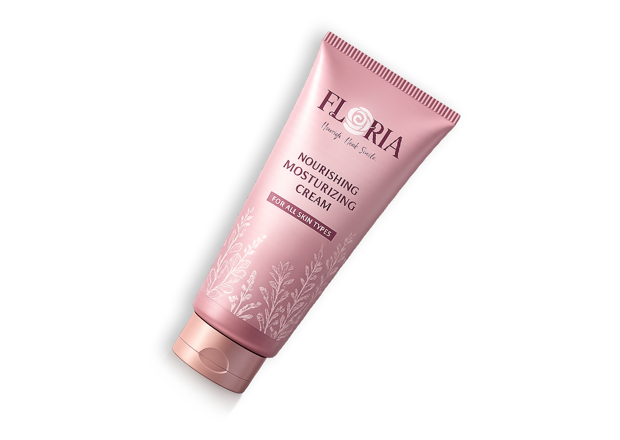
Floria
A cosmetic brand built around softness and ritual. The wordmark folds a rose into the "O" of Floria, and that motif carries through the packaging, gift bag, and print collateral a feminine identity meant to feel elegant rather than decorative.
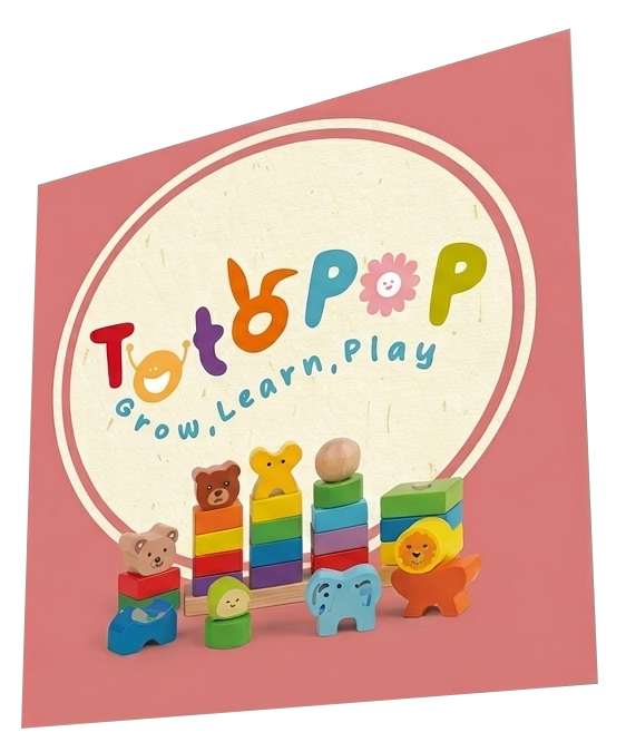
Totopop
A kids' brand identity designed to read as play before it reads as type — every letterform doubles as a character. Built out across a full merchandise line: apparel, tote bags, plush toys, and packaging, all sharing one rainbow palette.
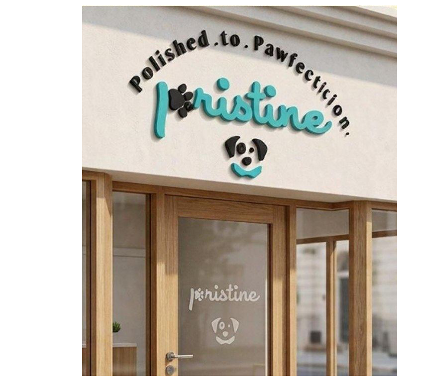
Pristine
"Polished to Pawfection" — a pet spa identity combining a paw print and a dog's face into one handwritten-style mark. The teal and black palette was chosen to feel fresh and clinical without losing warmth, and carries through storefront signage, grooming products, and retail packaging.
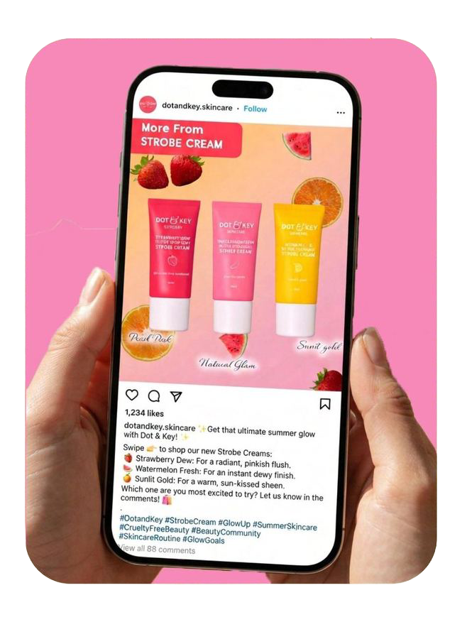
Skincare content
A set of Instagram posts and stories for a skincare line's summer product line, built around bright fruit-toned graphics and product-first layouts designed to stop the scroll while staying legible at feed size.
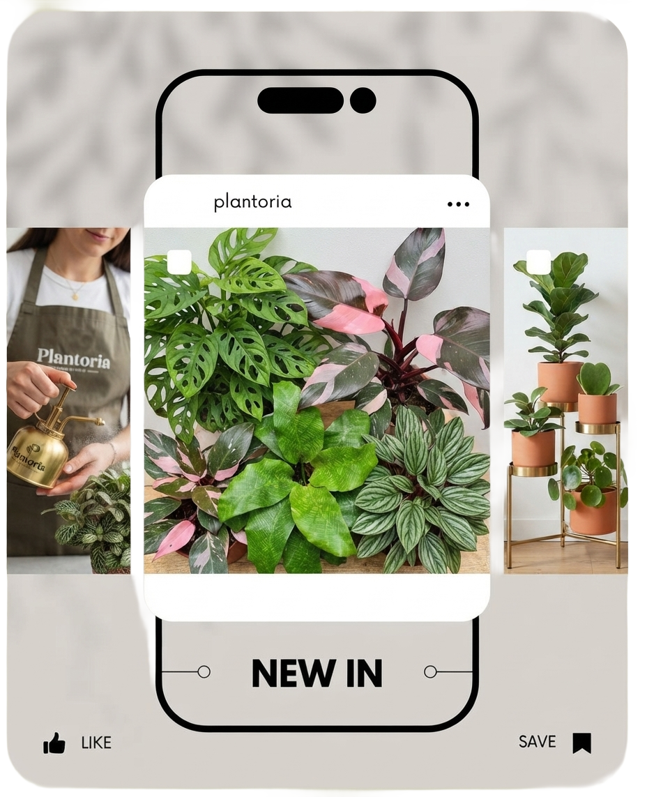
Plant shop content
Instagram content for an indoor plant shop, leaning on real texture and greenery rather than heavy graphics — the design work here is mostly restraint: a clean grid, a quiet wordmark, and layouts that let the plants do the talking.
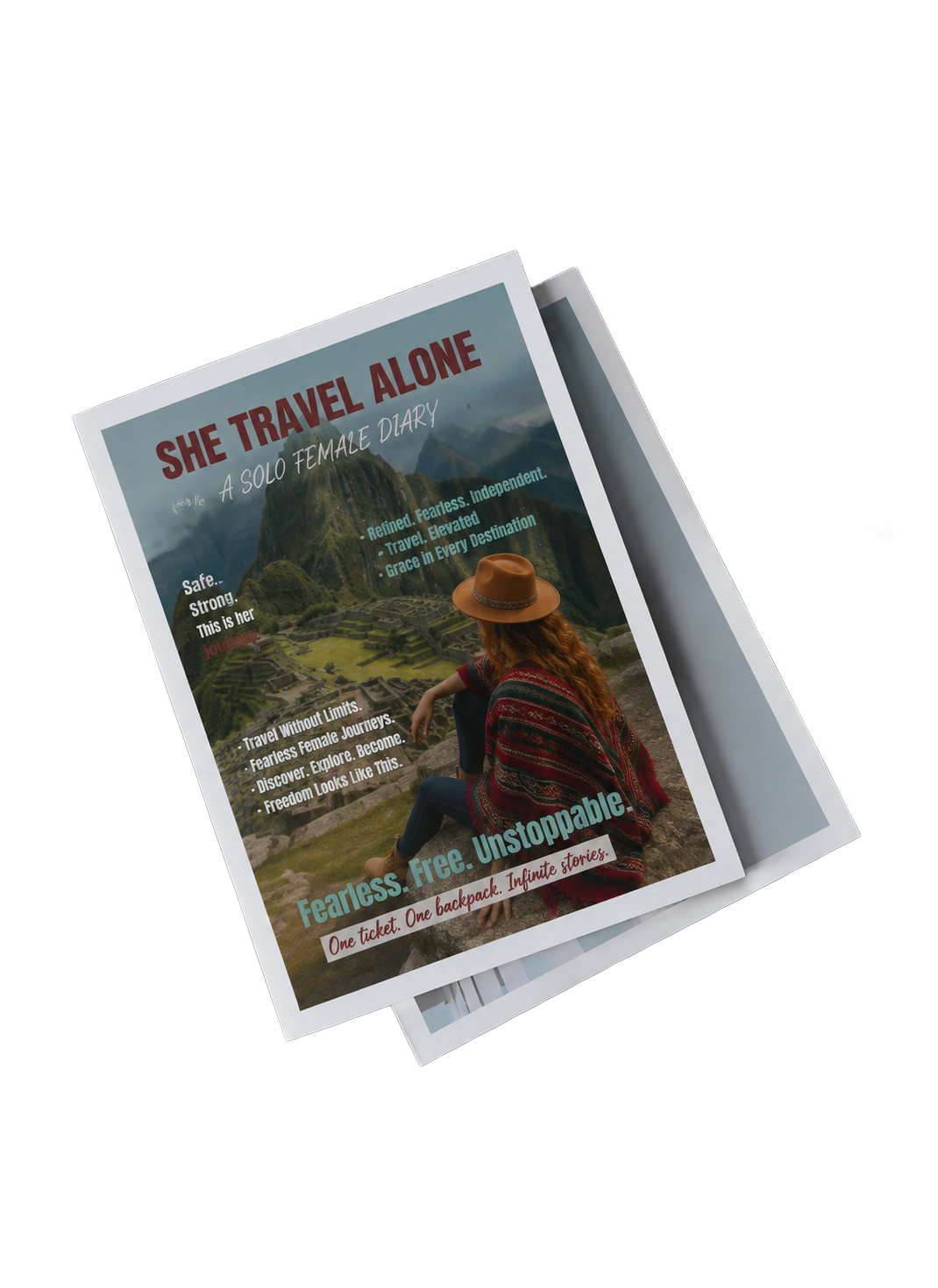
She Travel Alone
A magazine concept about the emotions and freedom of solo female travel — courage, independence, and self-discovery told through travel stories. I designed the cover and inside spreads, pairing a bold masthead with documentary-style photography.